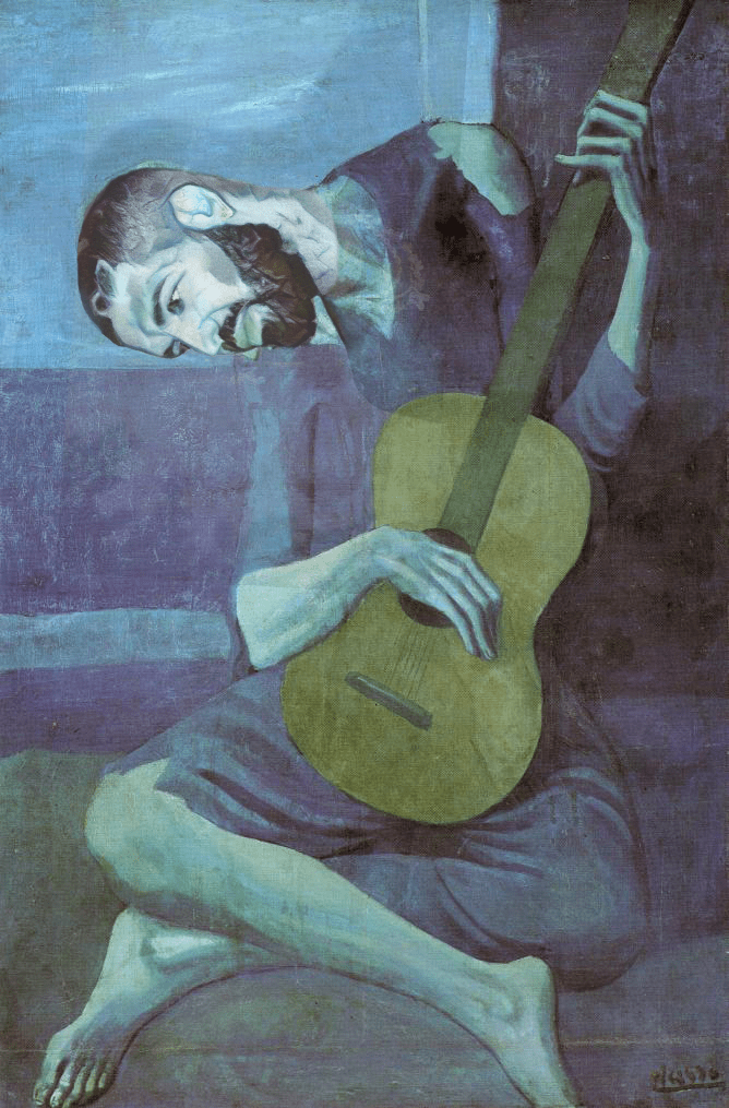
What do you hope your composite image communicates to the viewer? What statement is your piece making about culture today? I hope my composite image communicates the difference in textures to the viewer. The pictures I combined are a picture of Pablo Picasso’s and a picture of Canadian rapper, Drake. The textures and the type of styles are very different which makes the picture composite. The reason I chose the Picasso picture is because he is a very well-known artist and I liked the picture because it was a man playing music on the guitar. Secondly, I chose the picture of Drake because I like his music and he made a song called “Drew a Picasso.”
What advice would you give to a person looking to create a composite image in Photoshop? Advice I would give to a person looking to create a composite image is to have fun with using different textures and colors. I would also tell them to be creative with it because this project will be full of creativity and gives you freedom to choose what you want to do. Look for old paintings which interest you and that could work well with the picture. In summary, be creative with your composite image and use your imagination on this project.
What I like most about the photo is how the colors are blended in very nicely and it really makes it look like Drake is a painting. I also like how Drake is connected to the painting. The person in the painting is playing the guitar and is connected to music, and obviously Drake is one of the most popular musical artists in the world. One thing that could be better is how the neck is edited. The neck looks super long compared to the person in the painting. It does not look perfectly connected. One piece of advice I would give is just to spend a little more time editing. This way everything is perfect. The image will look fully connected and it will all look like one painting.
I like the details on the face, and how it blends into the painting. It really looks like it’s part of it. One thing that could be better is the connection between the neck and the head. The head looks more light, and it doesn’t blend well. Some advice I would give you is to make the images look smoother. If you blended the neck and the head, even though they were different colors, it would have looked a lot better.
What I like most about this photo is the quality. This Cretu was really good. I was surprised to see the quality of your image and the attention to detail. Everything is perfect.
One thing that could be better in the photo is the hue of Drake’s head. Maybe you could have made it slightly more blue? The lasso and hue tools are good for this, clone stamp tool will work as well.
One piece of advice for the photographer to help make their work better next time is to remember to make everything the correct hue. Drake’s head is slightly more white than the rest of the body. One way to fix this might be to lasso his head and then move the hue slider more towards blue.
What I liked the most about the image is how well the images go with each other. The image looks like it was originally one. The blending of this photo was insane and was one of my favorite photos.
One thing that could be better in this photo is if Drake’s head was facing upwards. I feel that the picture would look significantly better due to the fact that the picture is blended well already. I feel that this would add another element to the photo if the head was facing upwards.
One piece of advice that I would give to the photographer to make their work better is to make the colors in the photo pop more. This technique would make the photo a lot more attractive to the eye. Finally, I think a more clearer picture would have been better.
I really like how you chose Drake and a Picasso painting to show different kinds of art. I also really appreciate how you actually make it look like it’s one picture. You can blend Drake’s head perfectly to match the character in Picasso’s painting. Overall the painting is fine. However, one contrast that really sticks out is the differentiation between Drake’s rather white head and the blue-ish painting body. I think adding more blue color to Drake’s head would’ve been perfect to match with the painting. Next time, I would just make sure the picture has the general same color. There’s a white head and a blue body that just messes with the picture. Everything else looks really good.